Brand Identity · Web Design & Build
- Role
- Brand Strategy · Web Design · Social Content (Solo)
- Year
- 2026
- Client
- UNA Networx · local IT support
- Live
- unanetworx.com
- Deliverables
- Brand strategy · Logo system · Colour & type · Voice · Website · Social content
- Stack
- React · TanStack Start · Sanity CMS · Formspree
TL;DR
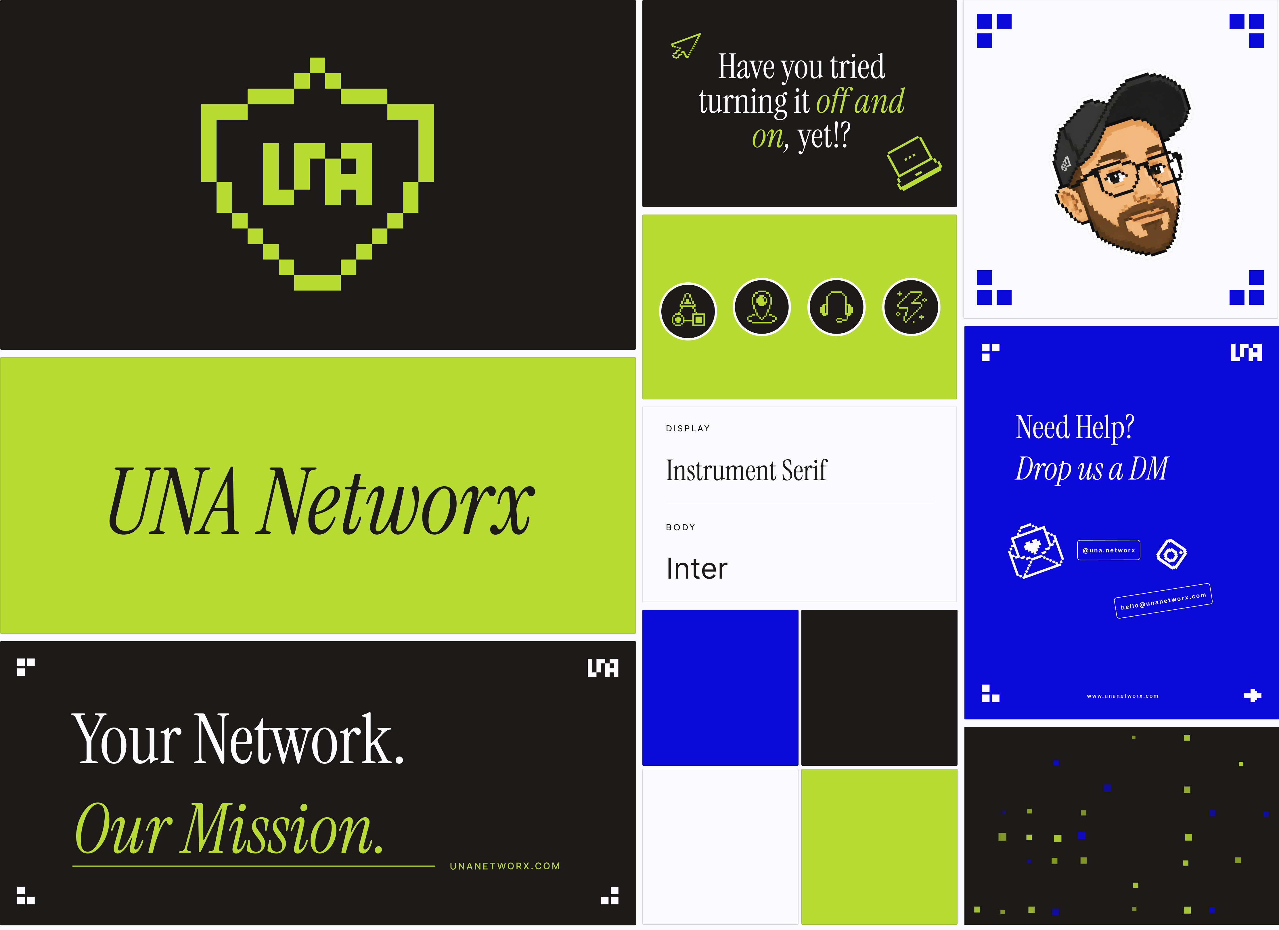
The whole system, on one board
Marks, palette, type and voice — laid out at a glance before the full walkthrough below.
The one who picks up is the one who fixes it
Ask a small business what it wants from IT support and the answer is rarely “cheaper” or “smarter”. It’s someone who picks up. In a 2025 survey of nearly 500 companies, 90% named response time as the single most important thing they look for in a provider. The top frustration, cited by 61%, was slow replies to calls and emails.
Most IT providers are MSPs: you call a help desk, get a ticket, and climb from tier 1 to tier 2 to tier 3 before anyone fixes anything. UNA Networx is a one-person shop, and that is the whole pitch. The person who answers is the person who fixes the problem. No tier 1, no tier 2, no hold music.
The weak point was the shopfront. UNA’s old site pulled roughly 170 visits a month, most of them bots, and read like a static brochure. Nothing on it said the one thing that made UNA different: you talk to the person who fixes it.
The brief for the rebrand, in the client’s words: fun, easy, professional, trustworthy.
- 90%
- of businesses name response time the top thing they want from IT support
- 61%
- name slow replies to calls and emails as their top frustration
- ~170
- visits a month to UNA's old site, most of them bots
Sources: MSP Success customer survey (2025, n≈500); UNA's old site, before the rebrand.
What I pulled out of the brief and the survey
- trust
- digital stream
- Una river
- scalable
- reasonable cost
- fun but professional
- clean
- not over-promising
- 8-bit
- personal
- network
- Star Wars
Asked how the brand should feel, one word kept surfacing however the question was put: trust. “Fun”, “trusting and clean”, “trustworthy”. The palette was already set in his head too: black, blue, green, after the river.
When I showed him moodboards, the one he lit up at was 8-bit pixel art. He’d grown up with it and loved the retro feel, and it became the concept the whole identity is built on.
Positioning & pillars
Have you tried turning it off and on, yet!?
Straight-talking IT support for people who’d rather run their business. Enterprise-grade managed services and security, built for small teams and priced without the app fatigue.
Retro-Modern Utility
Fun but professional, simple, high-fidelity digital craftsmanship.
Inspired by the Una river and a digital stream: a flowing, agile network. The 8-bit aesthetic isn’t just retro, it’s the building blocks of data, clarity and modular scalability for small businesses. It stands out in a sea of corporate minimalism.
Fun but Professional
Have you tried turning it off and on, yet!?
The client's own line, kept in the brand's back pocket. Wit lives in the tagline, the voice, and the moments something breaks. The system around it stays disciplined, so the humour reads as confidence, not schtick.
Grounded Trust & Real Care
Honest, reasonable cost, client-centric, not over-promising.
A transparent approach to business growth. Steady, reliable progress and actual human support, so small businesses feel looked after, not locked into a subscription.
A pixel shield around the letters
I sketched a few directions off the moodboard. He reacted to the 8-bit pixel concept straight away, so that became the identity. Every part of the mark carries a reason.
The pixels
The letters are drawn in 8-bit pixel art. Pixels as the building blocks of data, and the Una river read as a digital stream.
The shield
That meaning, made visual. “The only one” reads as unique and strong, so it began as a diamond in the sketches and resolved into a shield, which also stands for security.
The name
U N A, for the Una river in Bosnia, where the client is from. In Latin, una means “the only one”.
The shield works on its own, but it rarely appears alone. Paired with the wordmark, it becomes the lockup, and that pairing needed its own rules: how tall the shield stands against the type, how much air sits between them, at any size or orientation.
Construction & proportion
Every ratio here is a decision, not a guess. The shield stands taller than the wordmark on purpose, so it reads as the anchor of the lockup rather than a decoration beside it, in either orientation the mark runs.
Stacked lockup
The same ratios, turned vertical, for square formats where the wordmark can’t run alongside the shield: a square social post, a badge, a packaging sticker.
H = cap height
Scalability system
The mark has to work as a 24px browser-tab icon and as a two-storey billboard. That meant deciding exactly when it simplifies, and when the full lockup takes over.
Micro scale
24px favicon
The shield simplifies to a diamond and the letters drop to a single U, so it still reads at the size of a browser tab.

Mid scale
Social monogram, 48–96px
The shield drops away and the UNA letters carry the mark alone, for profile photos, app icons and Instagram posts where there’s a little more room to breathe.
Macro scale
Billboard lockup, 120px+
Same pixel grid, same serif contrast, no redrawing needed. Full lockup, not the icon alone: a new brand still needs the name to be understood at a glance, not just recognised.
On backgrounds
Tested against the client’s own palette, not just white, since that’s where the mark actually has to live.
Paper
Deep space
Growth green
Stream blue
Deep space · green mark
How not to use it
A few rules, so the system holds together even after it leaves my hands.
Don't stretch or condense
Don't recolour outside the palette
Don't rotate the mark
Don't add shadows or effects
The river, in five values
Deep space black is the grounding anchor: a premium, high-contrast canvas with a nod to that cinematic Star Wars depth. Stream blue is trust, technology and the Una river. Growth green signals scalability and crisp digital energy for a small business. Paper stays out of the way: the field everything else sits on. Cream is the warmer paper, held back for sections like the FAQ that want a softer read than the cool white field.
Deep space carries most of the weight. Blue and green work as accents, not fields, reserved for the moments that need to feel alive against all that black.
A dramatic serif for character, a neutral sans for clarity
Instrument Serif carries the display moments; Inter carries everything a reader actually reads. A pixel typeface, VT323, shows up in the small index numbers, the one place the 8-bit concept touches the type itself, not just the mark.
Aa
Display — Instrument Serif
Aa
Text — Inter
Type scale
Display
Instrument Serif · 60/61 · −0.02em
UNA Networx
Heading
Instrument Serif · 32/38 · −0.015em
UNA Networx
Body
Inter · 16/24 · normal
UNA Networx
Label
Inter Medium · 12/16 · 0.22em · uppercase
UNA Networx
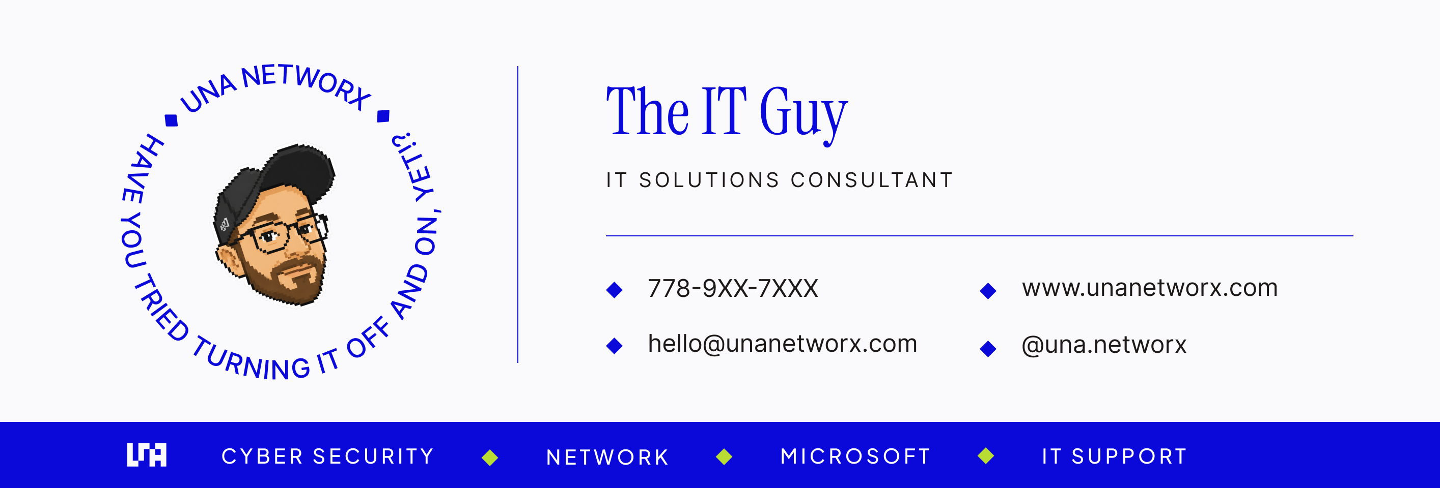
Also carries the rotating badge around the owner photo, set in this same Inter Medium rather than the display serif, which goes fragile on a tight curve.
Pixel index
VT323 · 20/20 · normal
UNA Networx
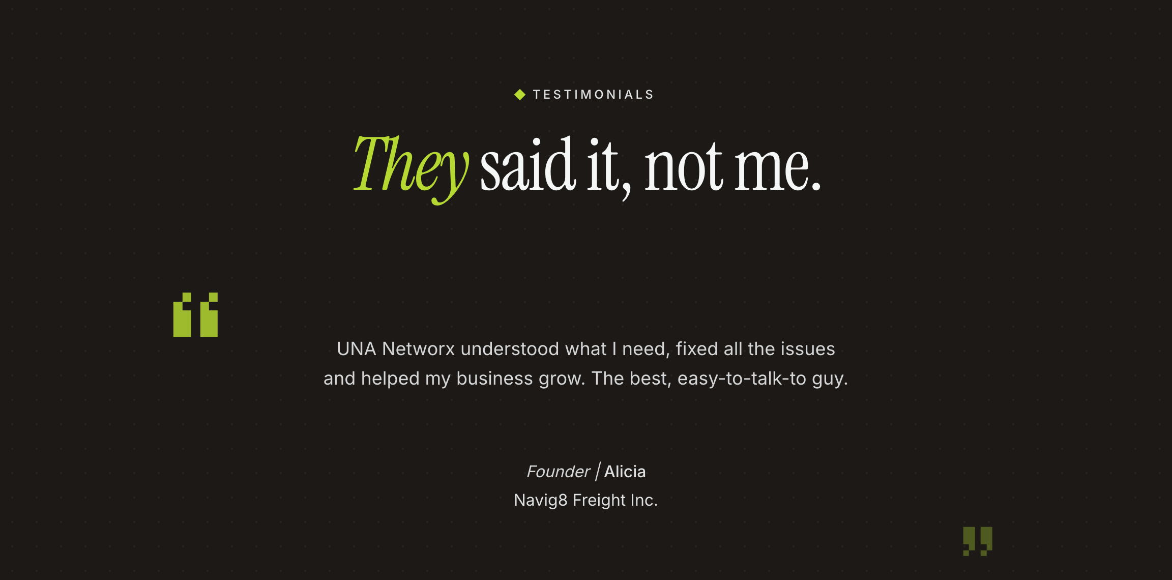
Wit, kept on a leash
He’s genuinely funny, and hiding that would make the brand feel fake. So the humour surfaces where it’s earned: the tagline, a 404 that jokes about a wrong turn, a testimonial labelled they said it, not me. Everywhere else, the voice stays plain and credible.
Retro is a flavour, not the whole meal
The site itself is modern and high-fidelity: plain-language services, visible proof, and contact never more than one click away.
Built in React on TanStack Start, for speed and clean SEO the old static page never had. Sanity CMS runs the services, FAQ and Instagram feed, and Formspree handles the contact form, so the client can keep the site current without touching code.
Designed around one promise
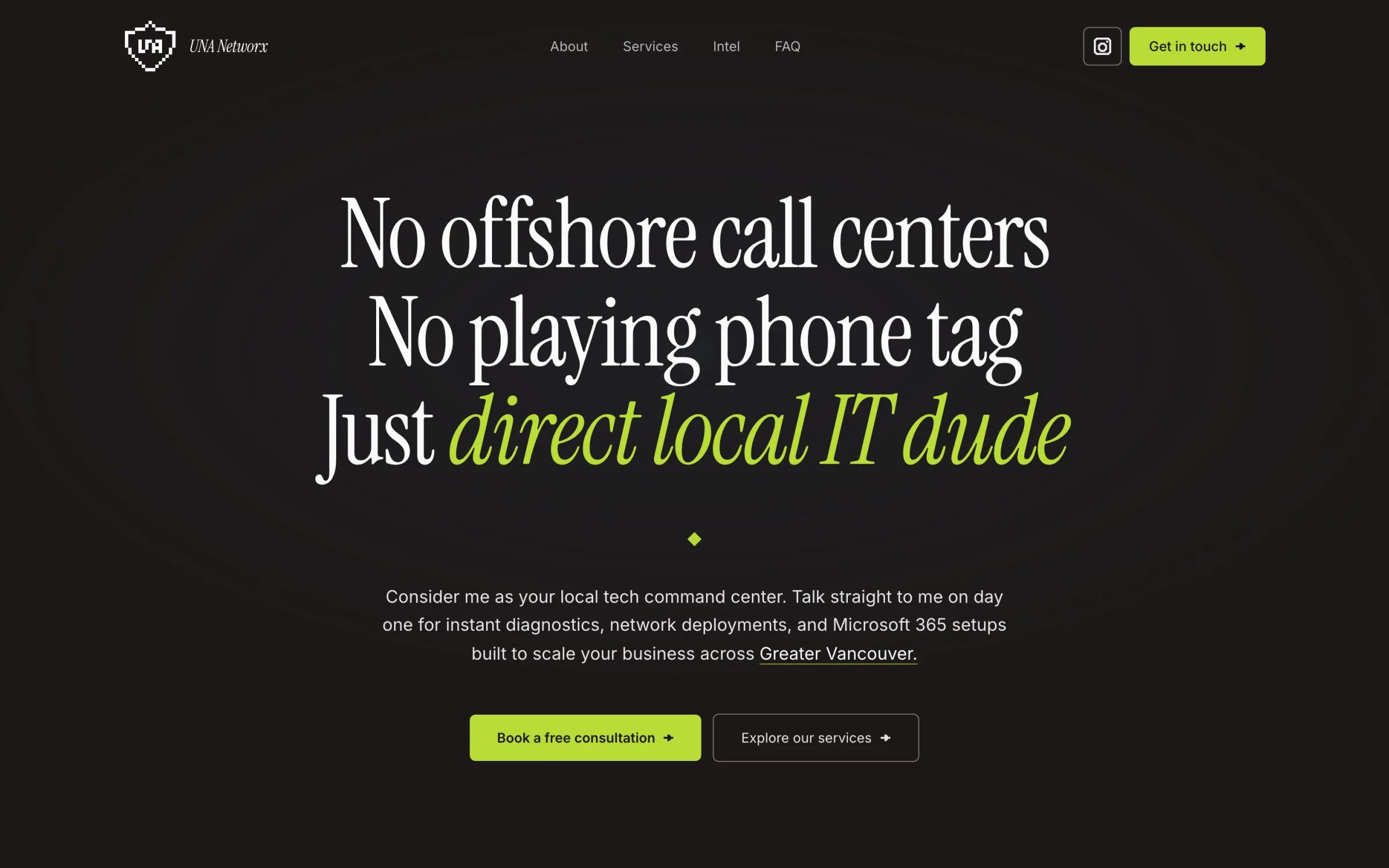
Clients want someone who picks up, not a call centre
The hero leads with the promise, not the services: no offshore call centres, no phone tag, just a direct local IT person.
Response time matters more than anything
The about section turns the promise into numbers people can hold him to: 1:1 direct partner, 24h response window, 100% local and accountable.
Getting in touch should never take effort
“Get in touch” stays in the header the whole way down, and the hero button jumps straight to the form. Instagram DMs and email sit next to it for people who'd rather skip forms.
The first reply should already be useful
The form asks how to reach you, email or phone, and what's breaking, from a short list of common problems, so he can start on the fix when he replies.
Trust means not over-promising
Operating hours and service areas sit right beside the form, and the send button repeats the promise: a reply within 24 hours.
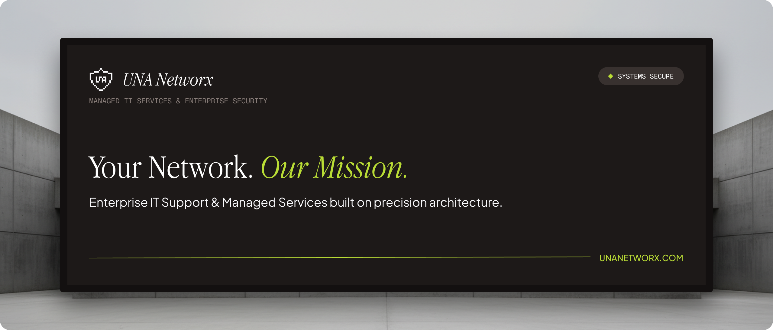
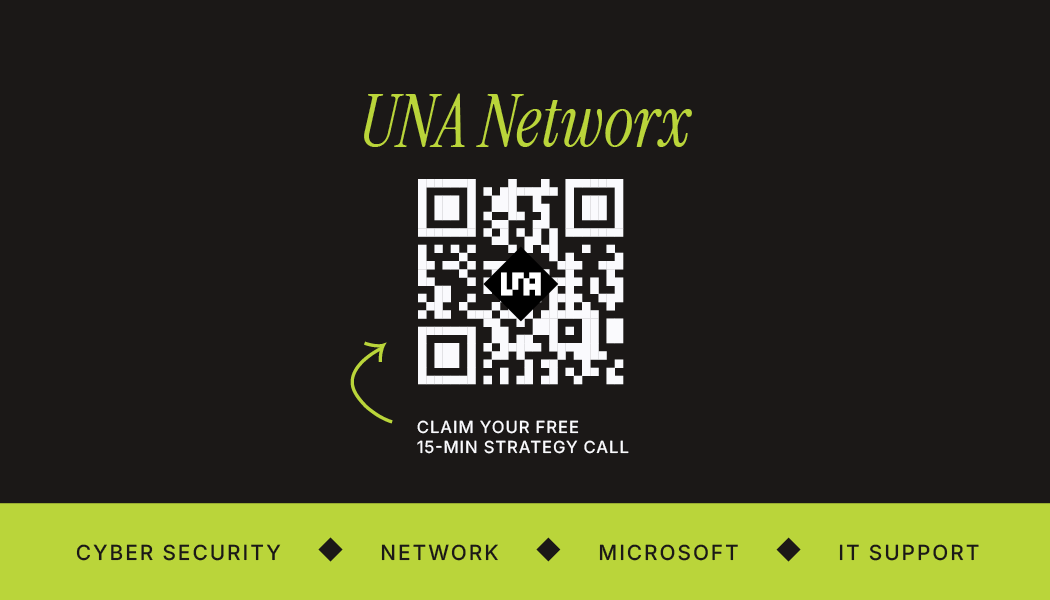
A digital identity they’re proud to hand out
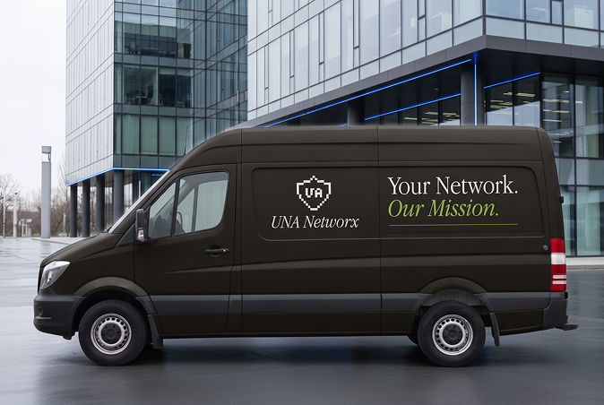
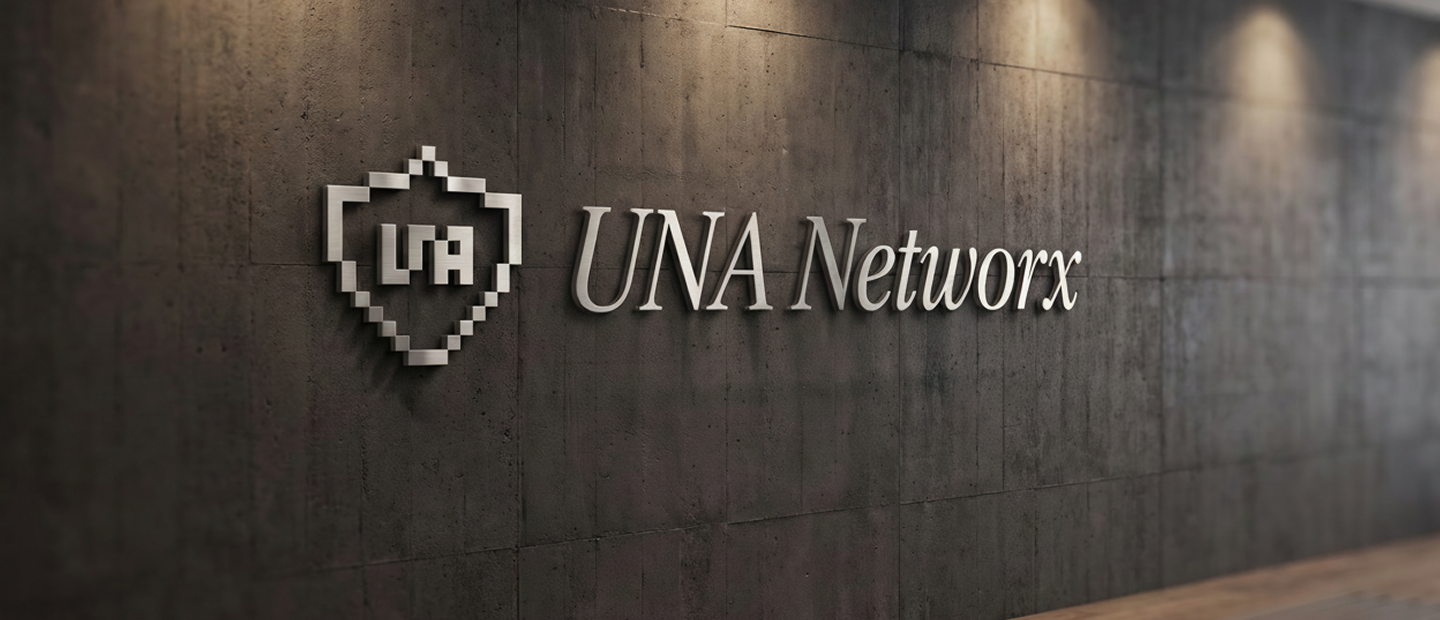
The mark carries past the screen, onto the things a small local company actually gives people.
The billboard, van and reception sign are speculative applications: they show how far the system can stretch, not things UNA uses today.

One system, shipped
Launched
Shipped end to end: strategy, identity, and a rebuilt website live at unanetworx.com.
One coherent system
Logo, colour, type, voice, website and collateral now speak with a single voice.
Built to hand out
A digital identity the owner is proud to share, and visitors a clear reason to reach out.
Reflection
A brand that finally matches the work
UNA now has a cohesive brand and website that match the quality of its work, giving the owner a digital identity he’s proud to hand out, and visitors a reason to reach out.