Brand Identity · Packaging
Refreshing cider,
made for hot days
Fizzy Folk is a cider brand concept born in Kelowna and raised on good times: lightly sparkling, made from real Okanagan apples, and built to keep the fun going all summer.
- Role
- Concept · Brand Design · Illustration
- Timeline
- 2 weeks
- Context
- School project
- Tools
- Illustrator · Photoshop
- Deliverables
- Brand identity · 3 flavour can labels · Dieline · Mockups
- Mockups
- Can renders in Photoshop · AI lifestyle scenes, added a year later
Problem
Cider sells the orchard
Most cider leans on the orchard: hand-drawn apples, script type, a heritage story. On a shelf, the cans start to look the same.
Solution
Sell the moment instead
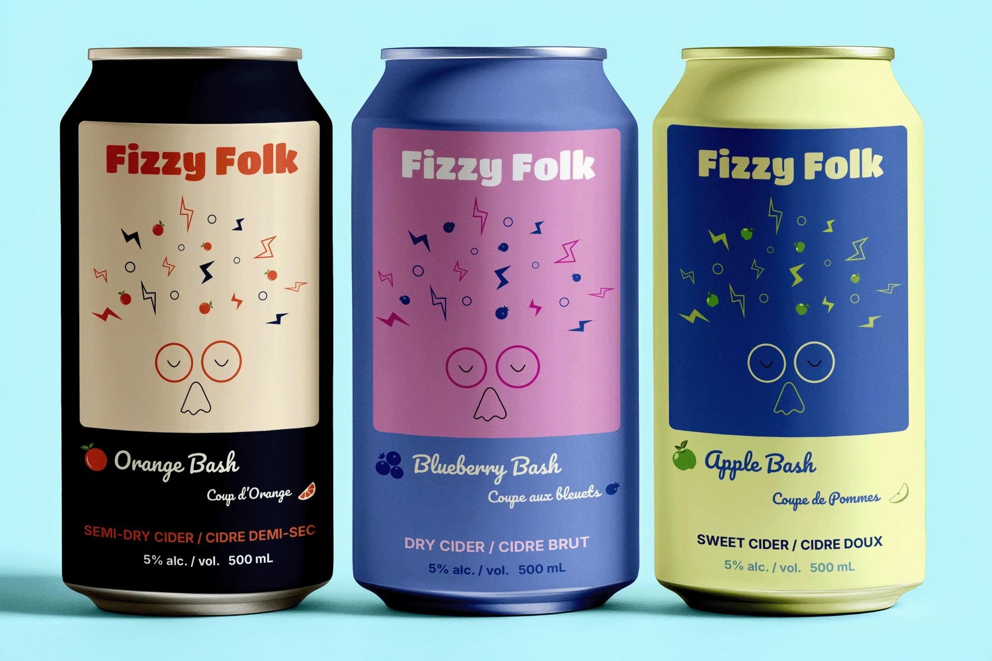
Fizzy Folk goes the other way. It’s about the moment you actually drink it: a hot afternoon in the Okanagan, nothing to do, good company. One relaxed character carries the whole brand, across three flavours that share a single label system.
A cider about the moment, not the orchard
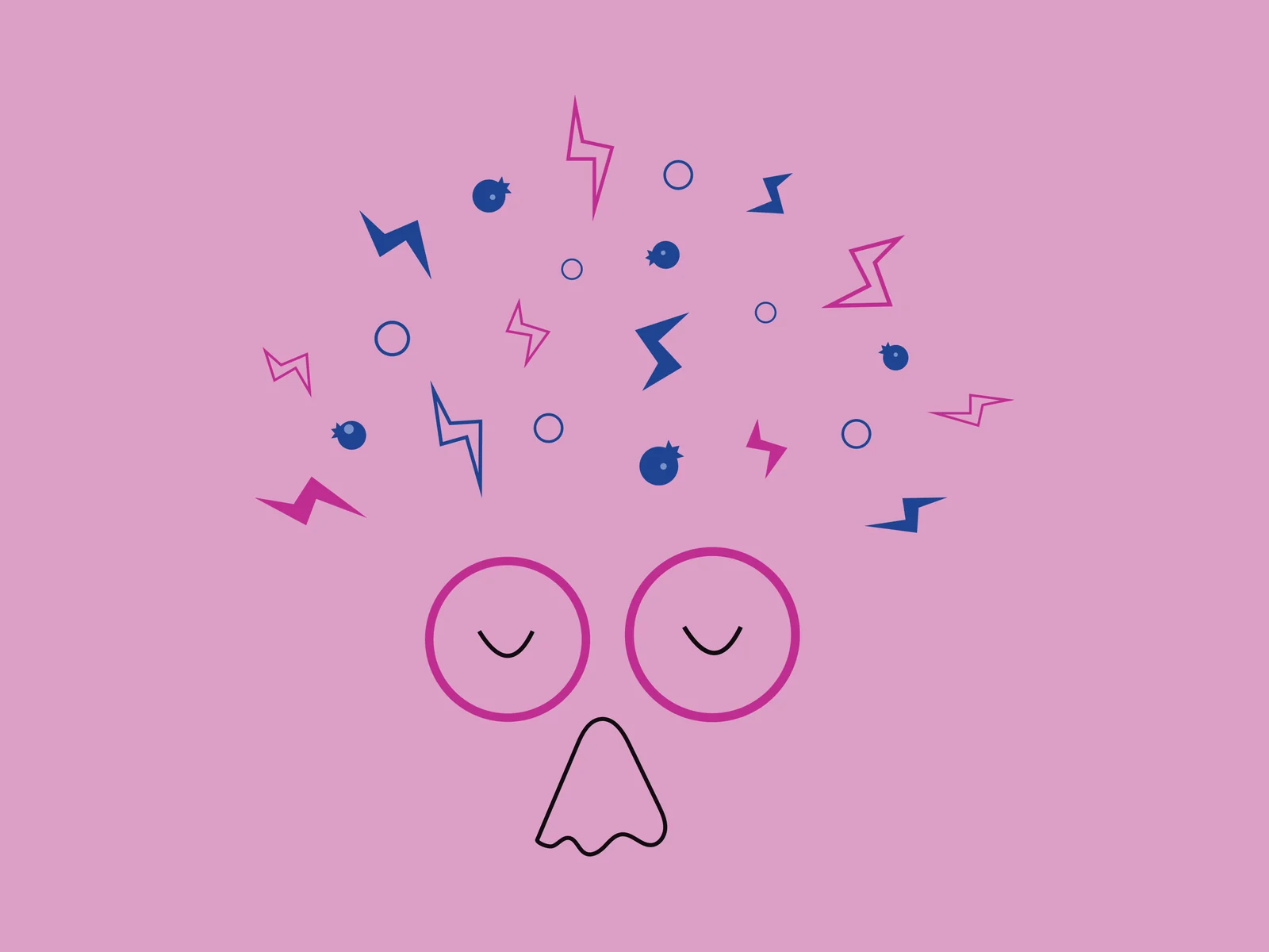
The brand has one character at its centre, and every part of it describes a sip of sparkling cider. The eyes are closed: mid-sip, completely at ease, the calm of the first taste.
The hair is what comes next. Bubbles, lightning strikes and pieces of fruit burst out of the head like fizz rising in the can, the little thrill that lands right after you drink. The fruit changes with each flavour, so the rush always matches what’s inside.
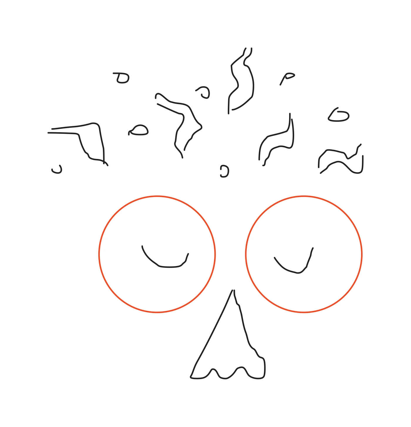
Calm face, lively hair: that contrast is the brand, and the type, colour and illustration are all built around it. It started as a quick line sketch of two round eyes, a nose and loose marks above the head that later became the fizz.
The logo is the main character
Traditional cider type looks back at the orchard. I wanted legal-age drinkers in their twenties to react to this one, so the wordmark is set in Titan One: heavy, rounded and relaxed, modern without trying too hard.
The character carries the rest of the identity. Its calm face sets the mood for the whole brand, and it holds up at any size, cropped to just the face as a mark or full-body on the can. The fruit in its hair and the colours around it are the only parts that change per flavour, which the next section unpacks.
“Eyes closed, enjoying the fizz: the mark and the mood are the same thing.”
Blueberry Bash
Orange Bash
Apple Bash
- Titan One · Wordmark
- Fizzy Folk
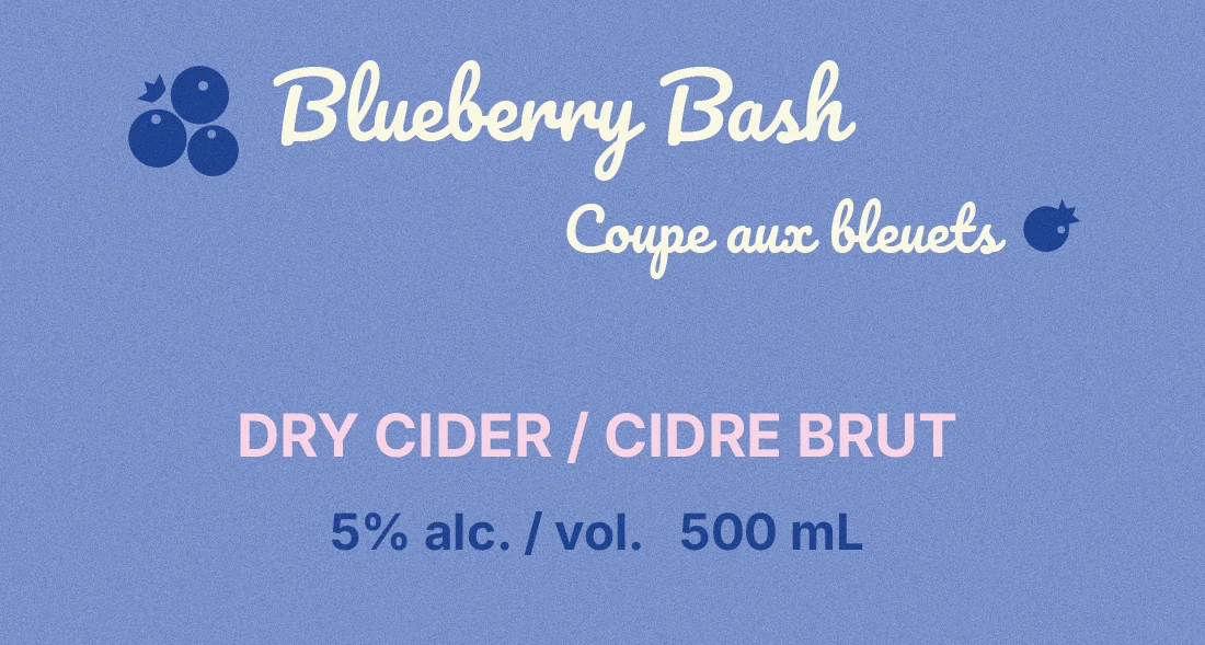
- Pacifico · Flavour names
- Blueberry Bash
- Inter · Supporting copy, bilingual
- DRY CIDER / CIDRE BRUT
Fizzy hair, one fruit per flavour
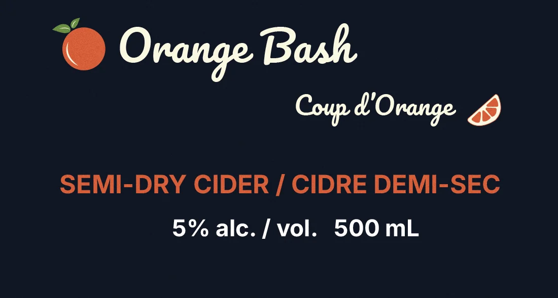
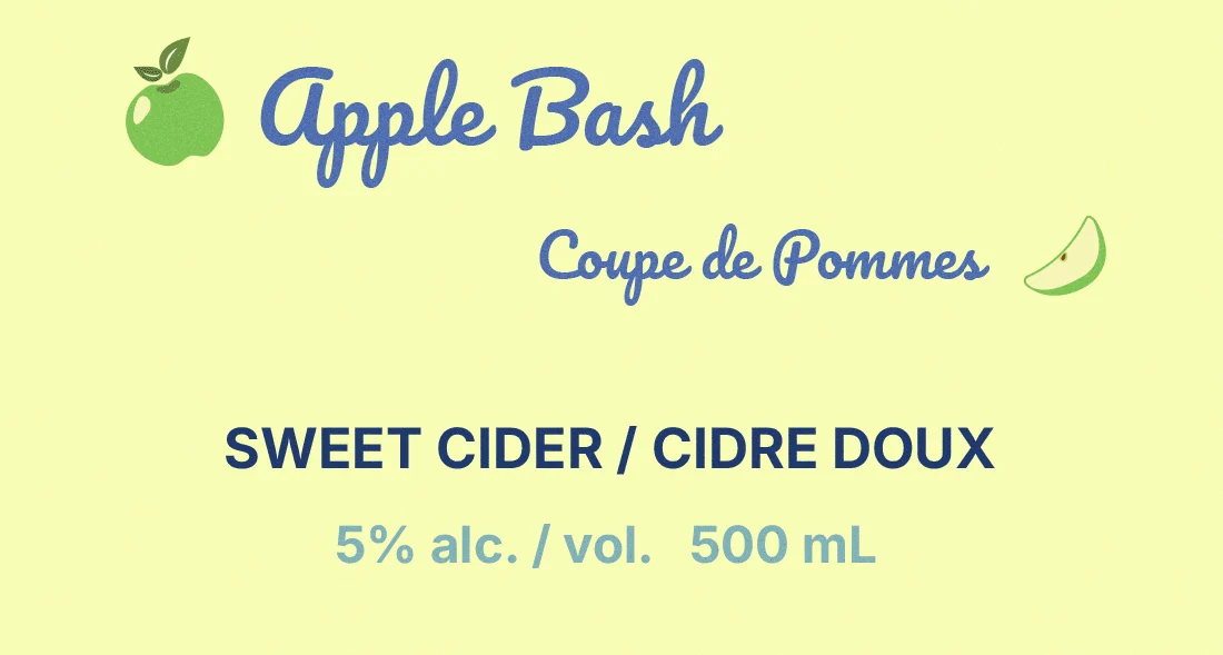
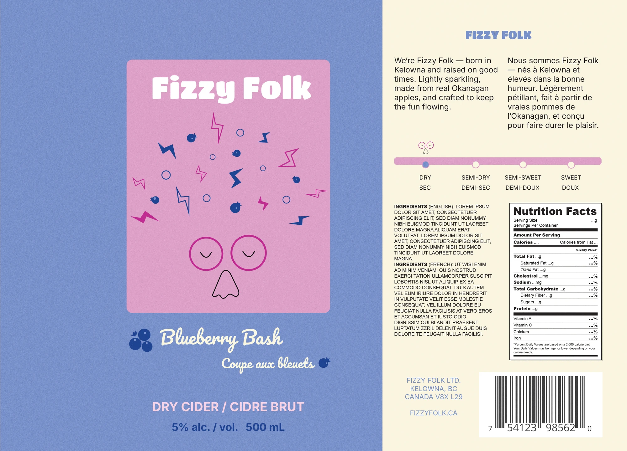
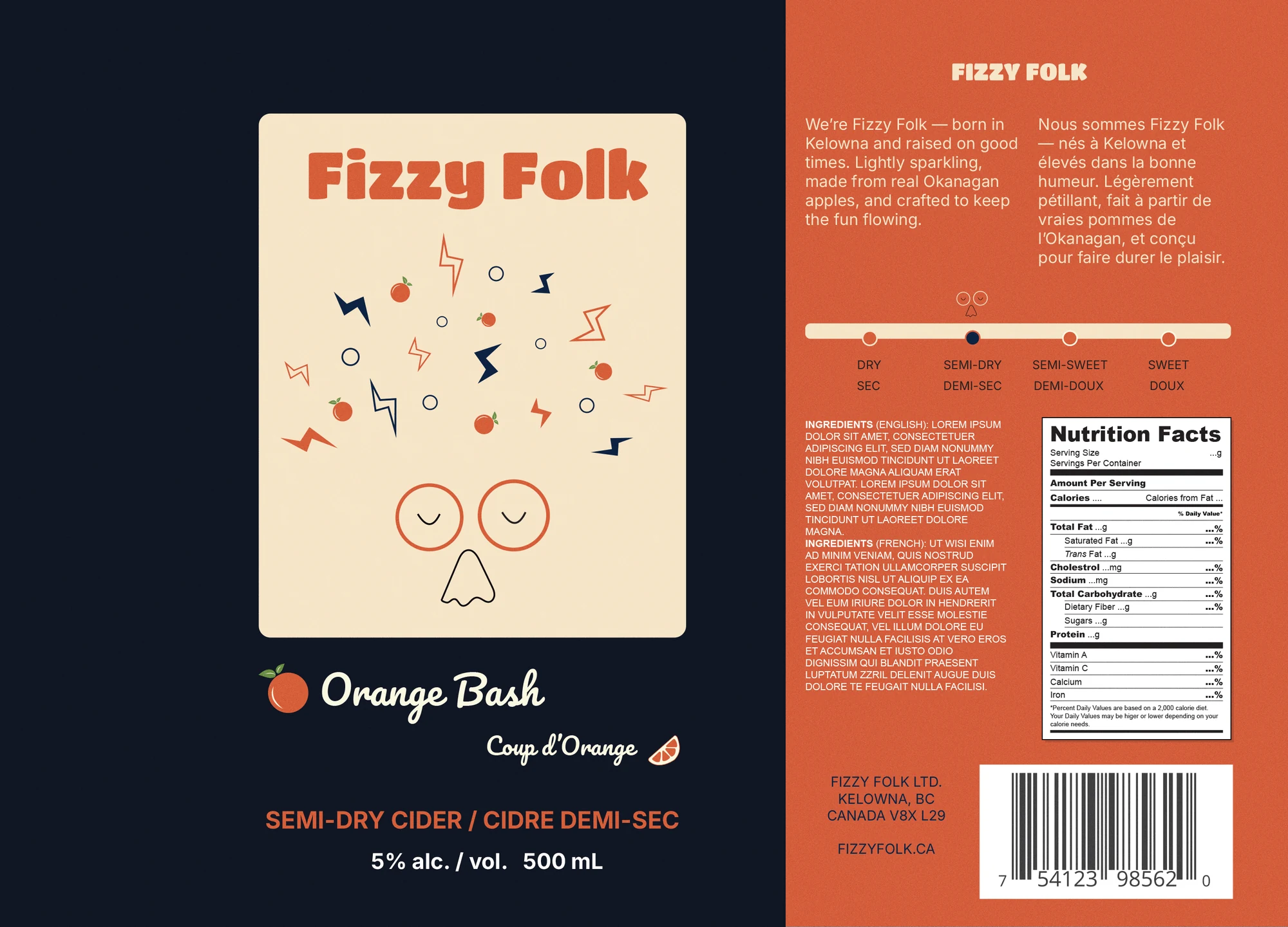
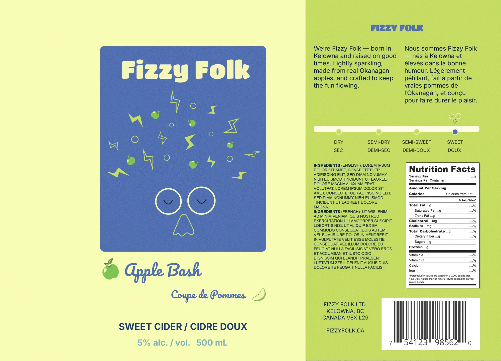
Every can shares one layout: the wordmark on top, the character in the panel, the flavour name below. Only three things change per flavour: the fruit in the hair, the colour palette and the sweetness. The range reads as one family, and each can still stands on its own.

Key decisions
One template, three flavours
One silhouette, swapped fruit and colour per flavour. It keeps the family tight on a shelf while giving every can its own personality.
The character reads the sweetness
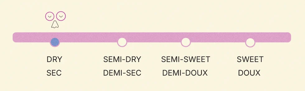
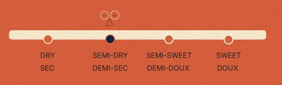
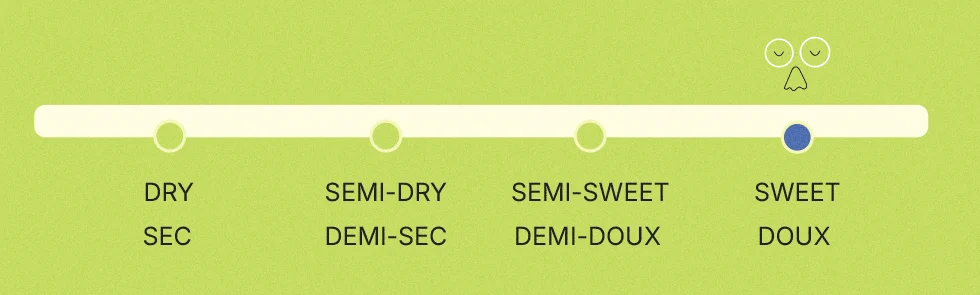
On the back, a small version of the face sits on a dry-to-sweet scale, so the mascot also tells you what you are buying.
Bilingual on every line
Every line on the can is set in English and French, from the flavour name to the sweetness scale.
Drawn on a real dieline, not just a render
The can carries the whole identity: character front and centre, flavour in the hair, minimal supporting copy. The label was drawn on a standard 500 mL sleeve dieline, so it’s production-ready rather than a one-off mockup.
Testing the cans in context
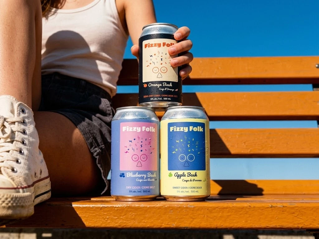
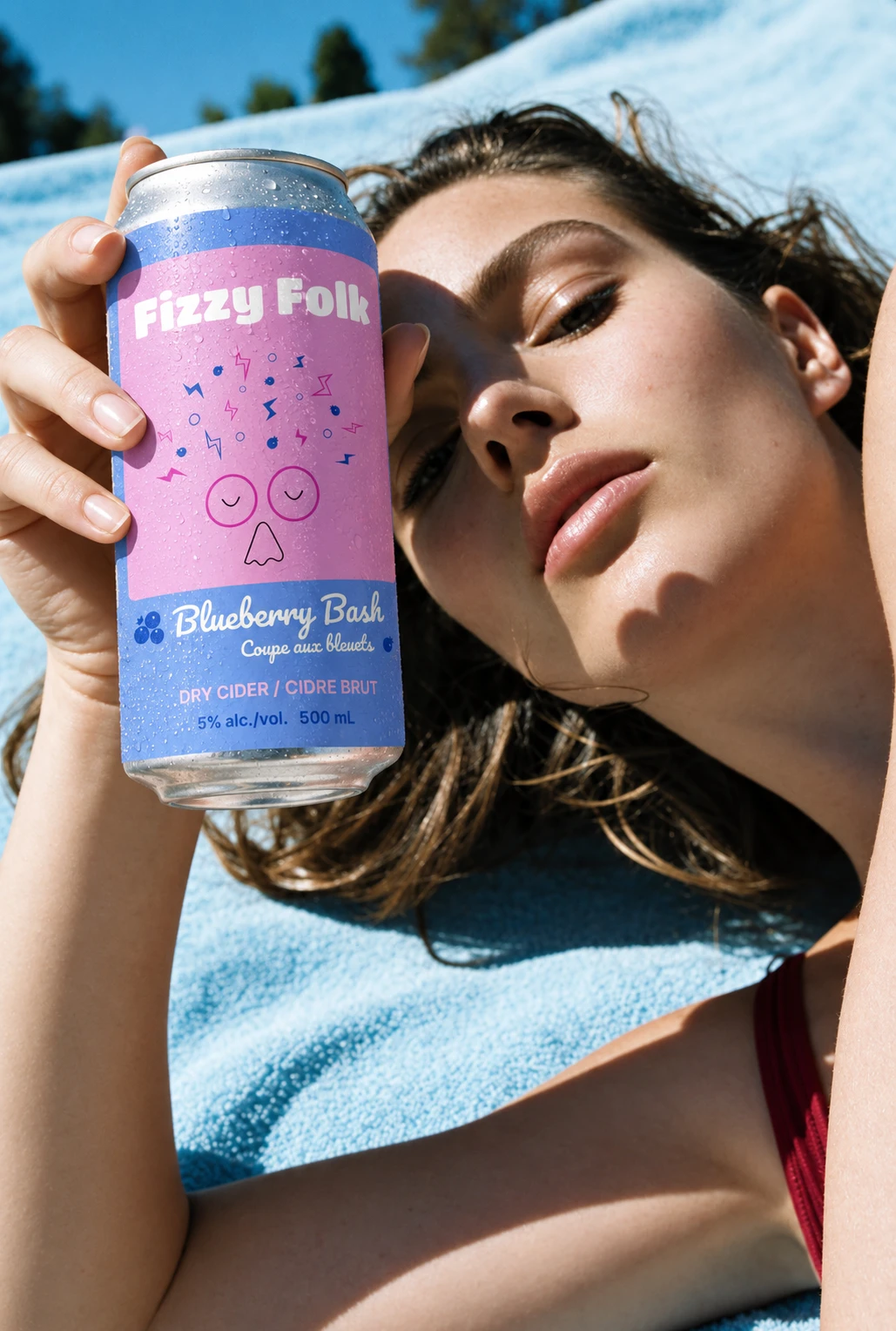
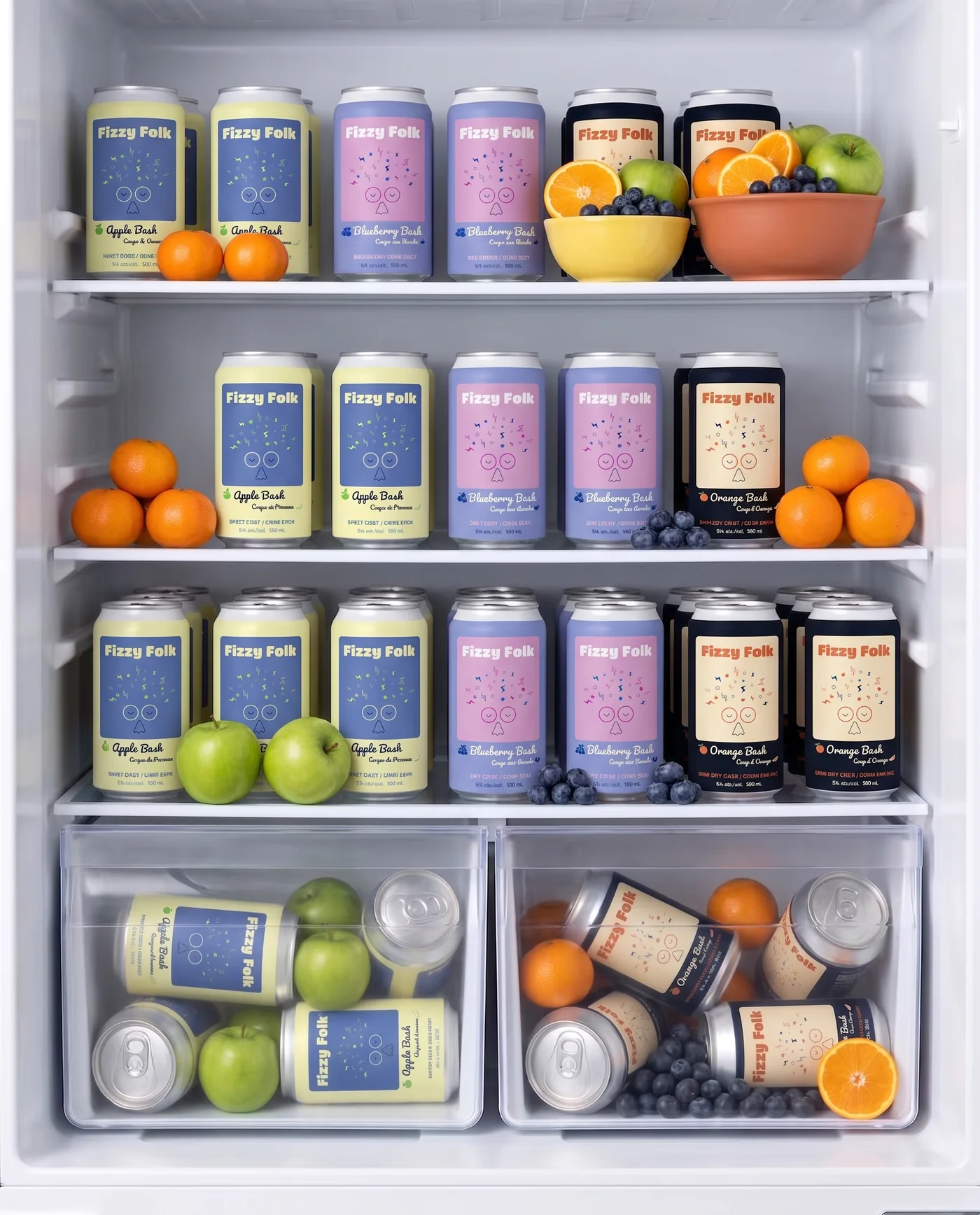
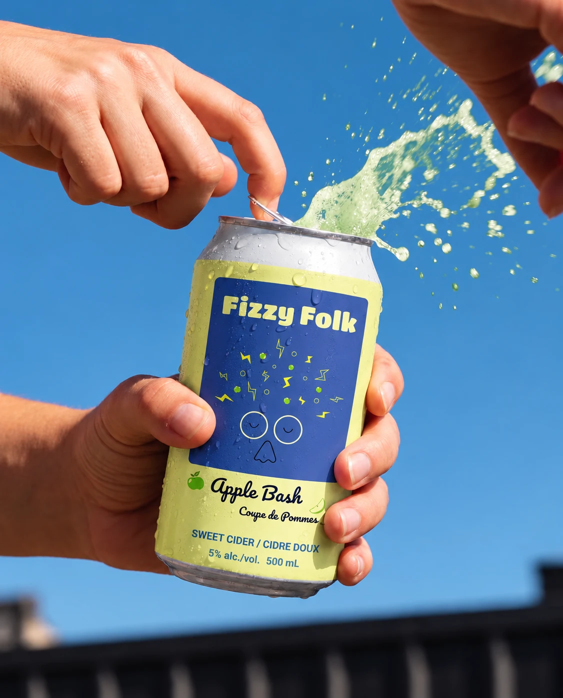
The original project ended with the labels and can renders, all made in Illustrator and Photoshop. Almost a year later, I came back to it to practise an AI mockup workflow, generating lifestyle scenes from the finished label artwork. They are mockups, not photography, used to check that the colours and the character still read in a fridge, in a hand and in bright sun.
What I took away
Reflection
The character does the heavy lifting
Fizzy Folk started as a two-week packaging concept and became the brand I keep coming back to. A strong character does a lot of the work: once the face lands, the colour, type and applications mostly follow.
Built to extend
Designing for the next flavour
Drinks brands rarely stop at three flavours. New and seasonal ones keep arriving, so a can has to work as a system, not a one-off label. In Fizzy Folk, a new flavour changes only the fruit in the hair, the colour palette and the sweetness marker. The character, wordmark, layout and dieline stay fixed, so a fourth can is a swap, not a redesign. That is the lesson I took into packaging: design the system before the label.
A year later
Revisiting it with AI in the workflow
Fizzy Folk began as a school project, and everything in it was made by hand in Illustrator and Photoshop. Almost a year later, I returned to it to practise a workflow closer to how studios work now: the design stays mine, and AI image tools turn the finished artwork into lifestyle mockups a client can react to, without staging a photoshoot. I used Higgsfield and Gemini.
The catch is control. The tools blur small type and quietly redraw details, so every generated scene still needs a designer’s check before it goes in front of anyone, and here each one is labelled as AI.